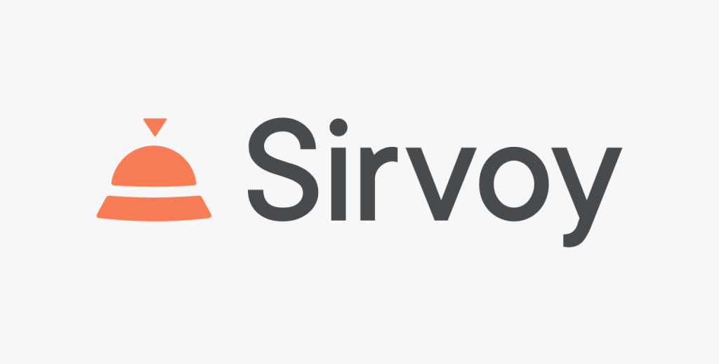
We want every aspect of Sirvoy to communicate who we truly are and for every client to experience our mission. Each day our teams work with the same focus; to put hoteliers and their guests at the heart of everything we do. This leads to constant development, to continue meeting the needs of our clients. The time has come for the Sirvoy logo to follow suit in that same direction. Thanks to thorough work from our product team, we are proud to present the new Sirvoy logo.
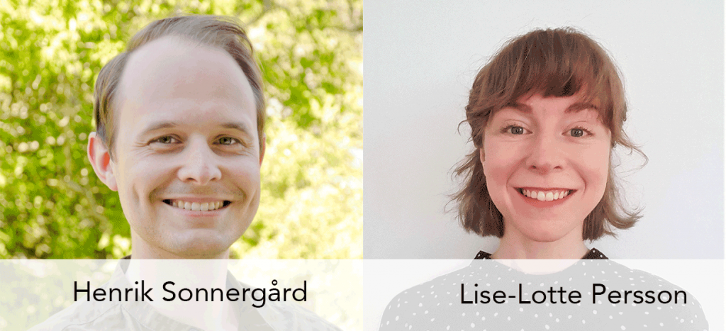
We are sure many of you hoteliers have worked hard to produce a suitable logo that sets the right brand tone for your business. So maybe you will recognize yourselves or get inspired to do the same, as we meet with our illustrator Lise-Lotte Persson and front end developer Henrik Sonnergård, who have been in charge of this process in Sirvoy.

What was the reason for developing the new logo?
We needed something fresh as a starting point for developing our new branding and even though the old logo was a strong identifier, it had a few issues, says Henrik.
Yes, I totally agree, says Lise-Lotte. We loved the old logo but it wasn´t very scalable. It was two icons in one, a reception bell inside a pin. This made the bell very small and hard to discern, especially at small sizes. There were even some who have worked for Sirvoy for years, that had no clue the bell was part of our logo, she adds with a smile.
How was the process, was it a difficult one?
It was challenging but fun, Lise-Lotte continues. Something that I found especially interesting was the surveys we conducted. We had both internal and external ones with different logo options. The results surprised us at times and gave us the courage to go down the minimalistic route. Something we realized from the feedback was that the logo we finally settled on, best conveyed our brand tone.
Yes, it’s important that the logo harmonizes with other parts of the brand. Working with design and especially typefaces and typography is something I really enjoy, says Henrik. But it felt like a big responsibility to make the right decisions and sometimes it was hard to distinguish between facts and opinions, especially my own.
“We expect the new logo to better reflect what Sirvoy is all about.”
So here it is, Sirvoy’s new logo! Lise-Lotte, how would you describe it?

It´s a reception bell, an icon closely related to our business. The bell symbolizes our outstanding support. The minimalistic style stands for a straightforward and easy-to-use system. Taking the minimalistic route, we did have concerns that people would have trouble identifying the bell. But we realized that there are real benefits in using an abstract logo. Looking at something abstract you use your imagination to a greater extent and therefore get more involved and attached. We expect the new logo to better reflect what Sirvoy is all about.
Finally, what more can we expect in the future?
Well, we’re hard at work with the rest of our new branding and have recently released internal guidelines for a new colour palette and typography, says Henrik. We’re taking many factors into account, like customer feedback and accessibility. We are really excited about how this will improve our products in times to come.


